
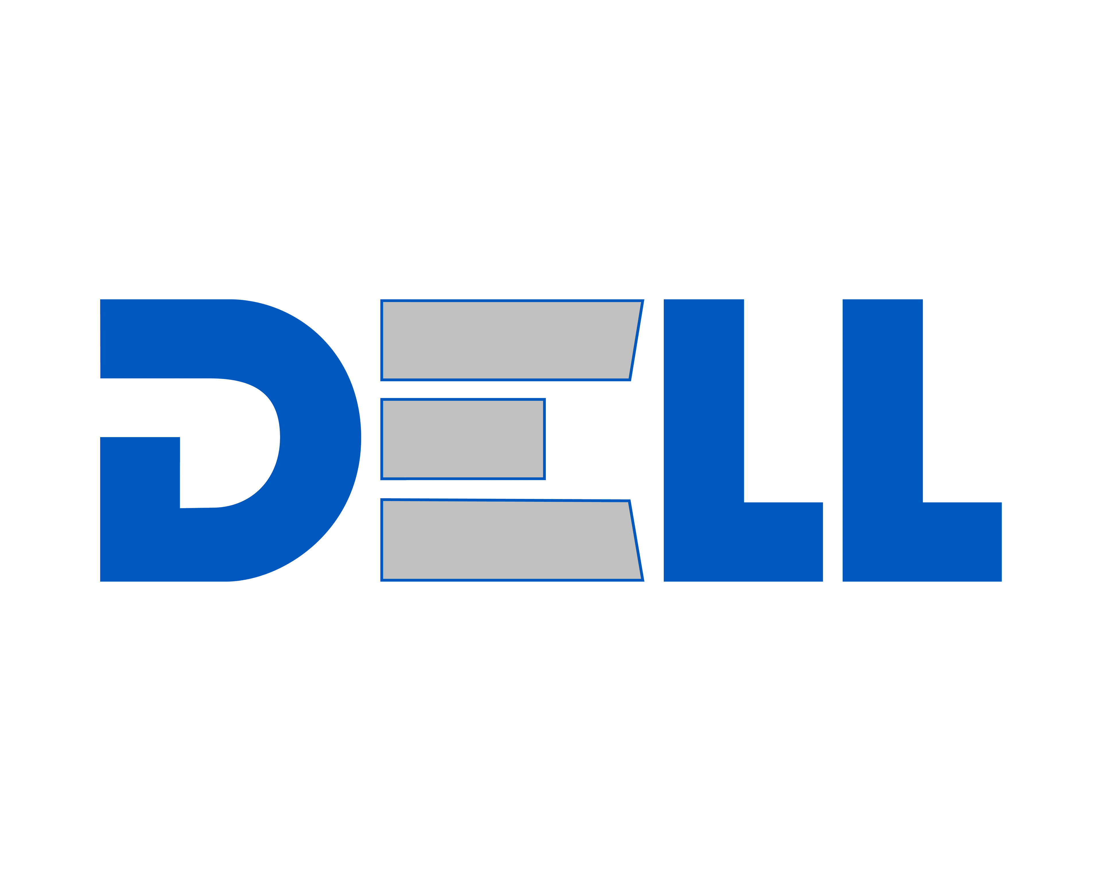
For the Dell rebrand, the goal was to modernize the logo with a bold, technological look. The updated design uses a sleek sans serif font in Dell’s signature blue (#0057B7) with accents of silver (#C0C0C0) to add depth and highlight the brand’s innovative identity. Key adjustments include negative space in the "D" and slanted corners for a futuristic feel, removing the traditional inverted "E" to create a cleaner, more impactful look. This rebrand enhances Dell’s visual identity, aligning it with a contemporary tech-forward market. This was for my studio 5 course.
software Illustrator, photoshop
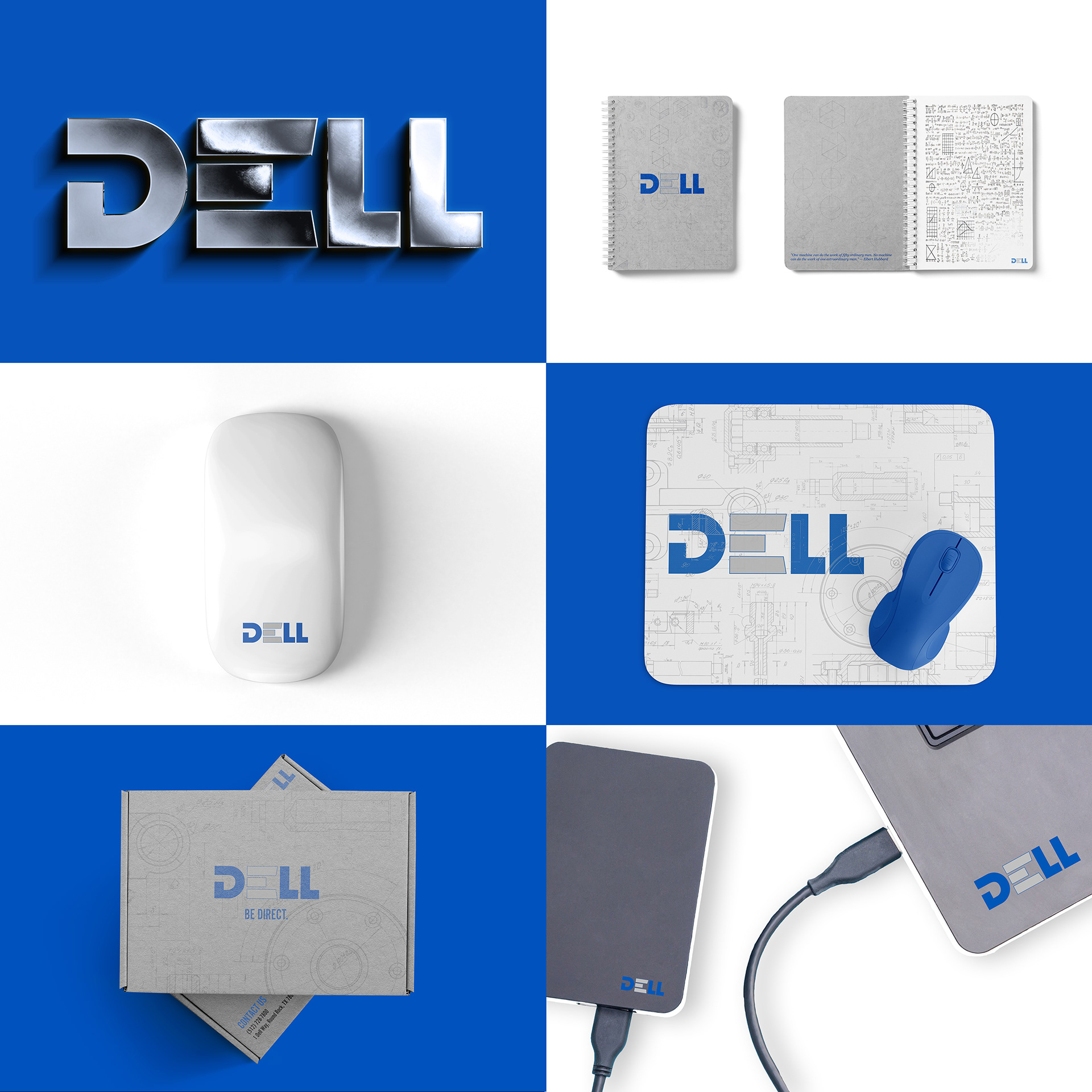
LOGO USAGE
APPLICAtion
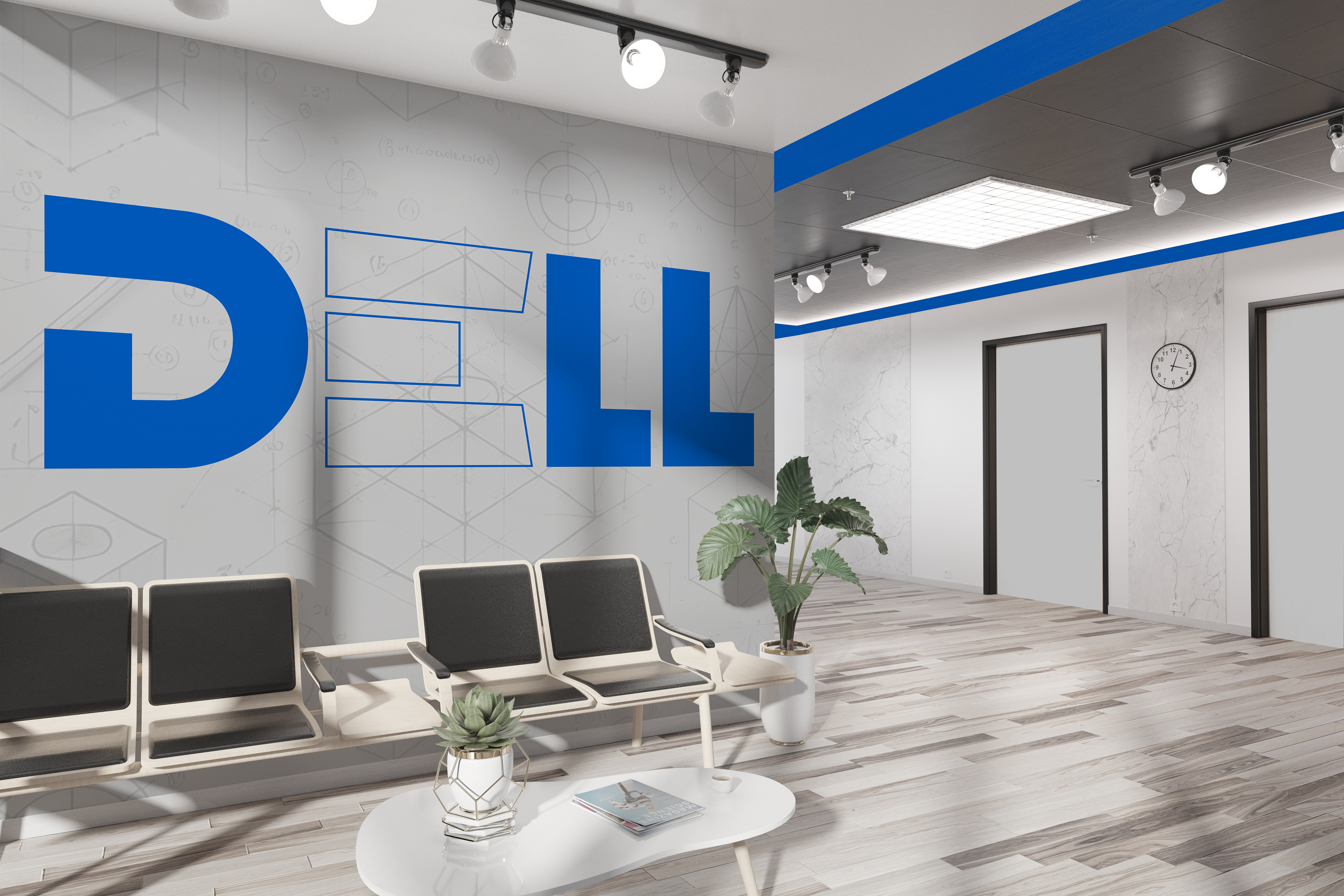
Experiential Design
COlor palette